
PREFACE
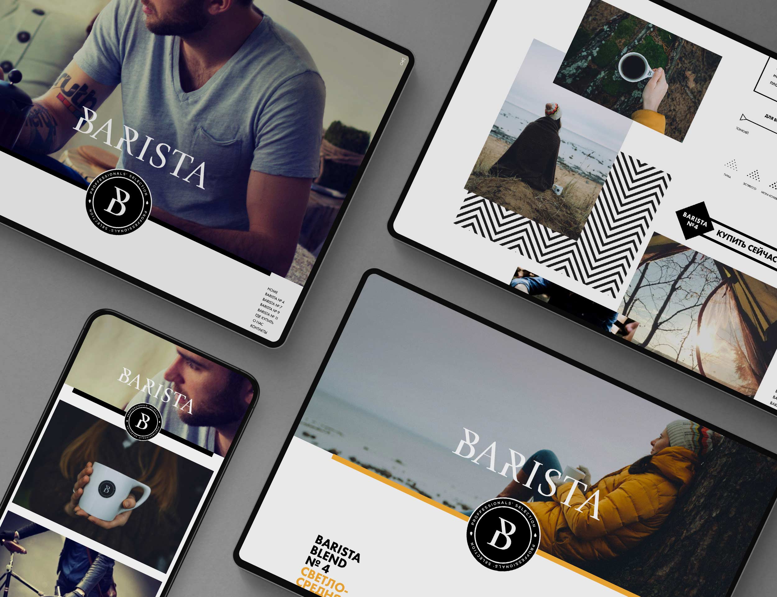
Barista, a coffee brand of the Russian-based Soyuz Coffee Roasting Company, offers four coffee blends, which differ in flavour and strength.
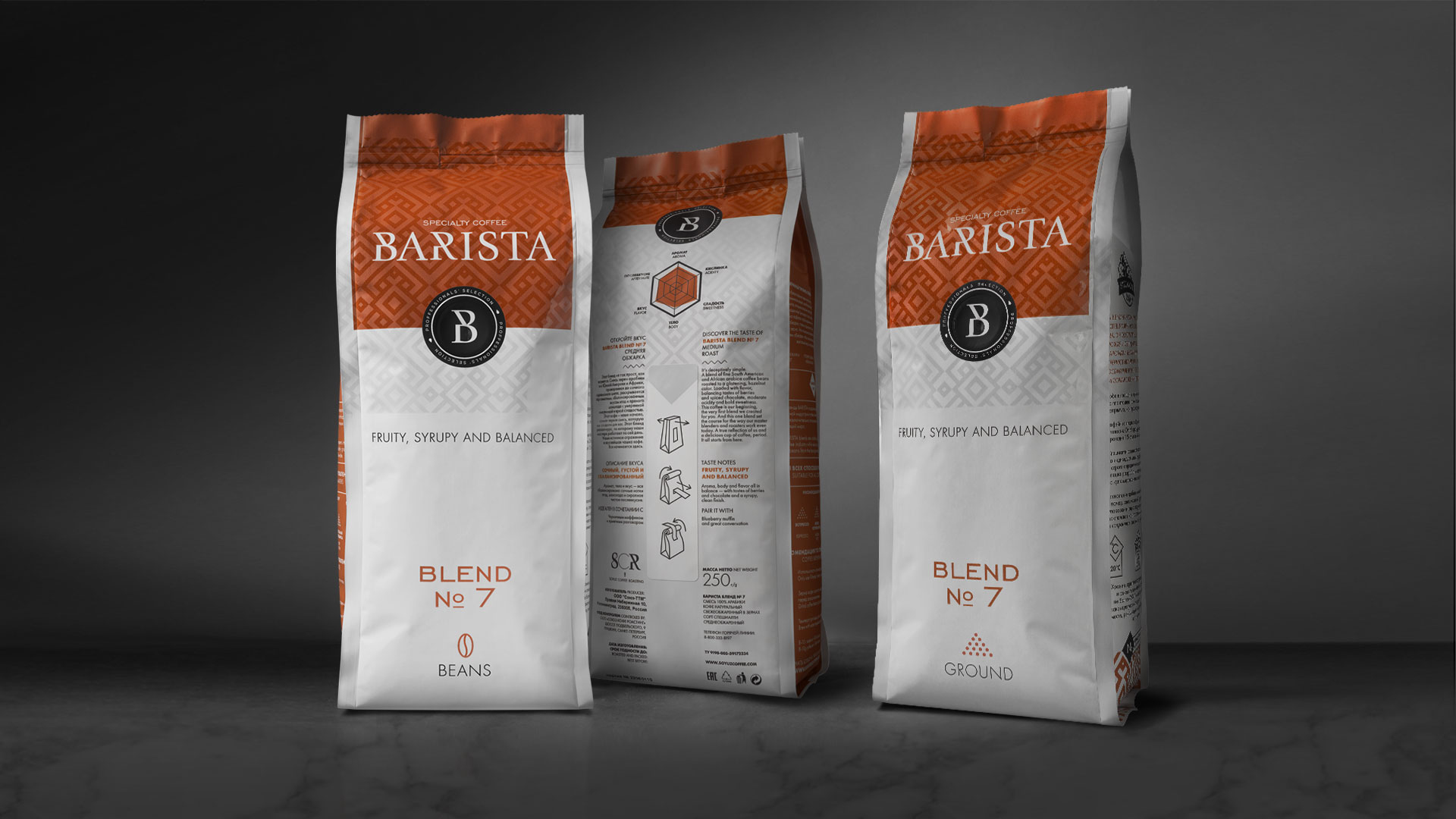
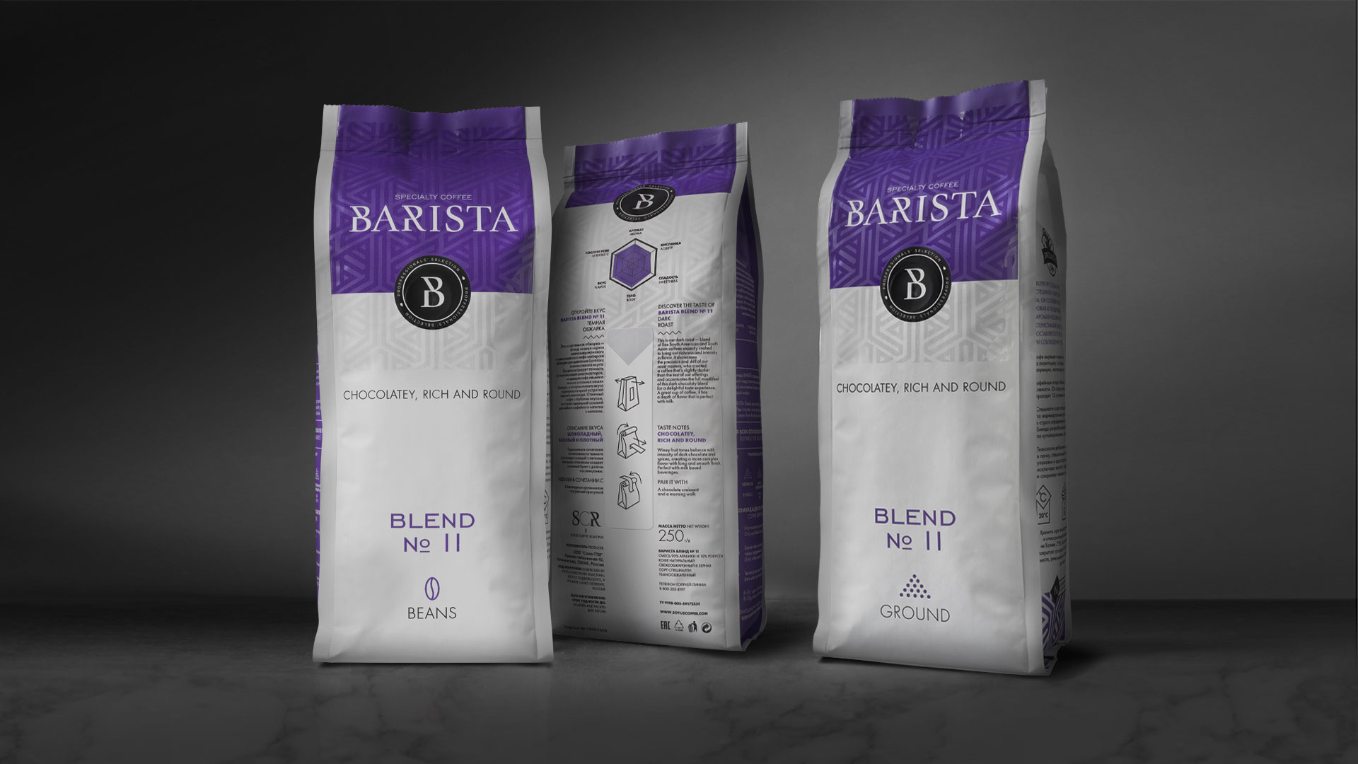
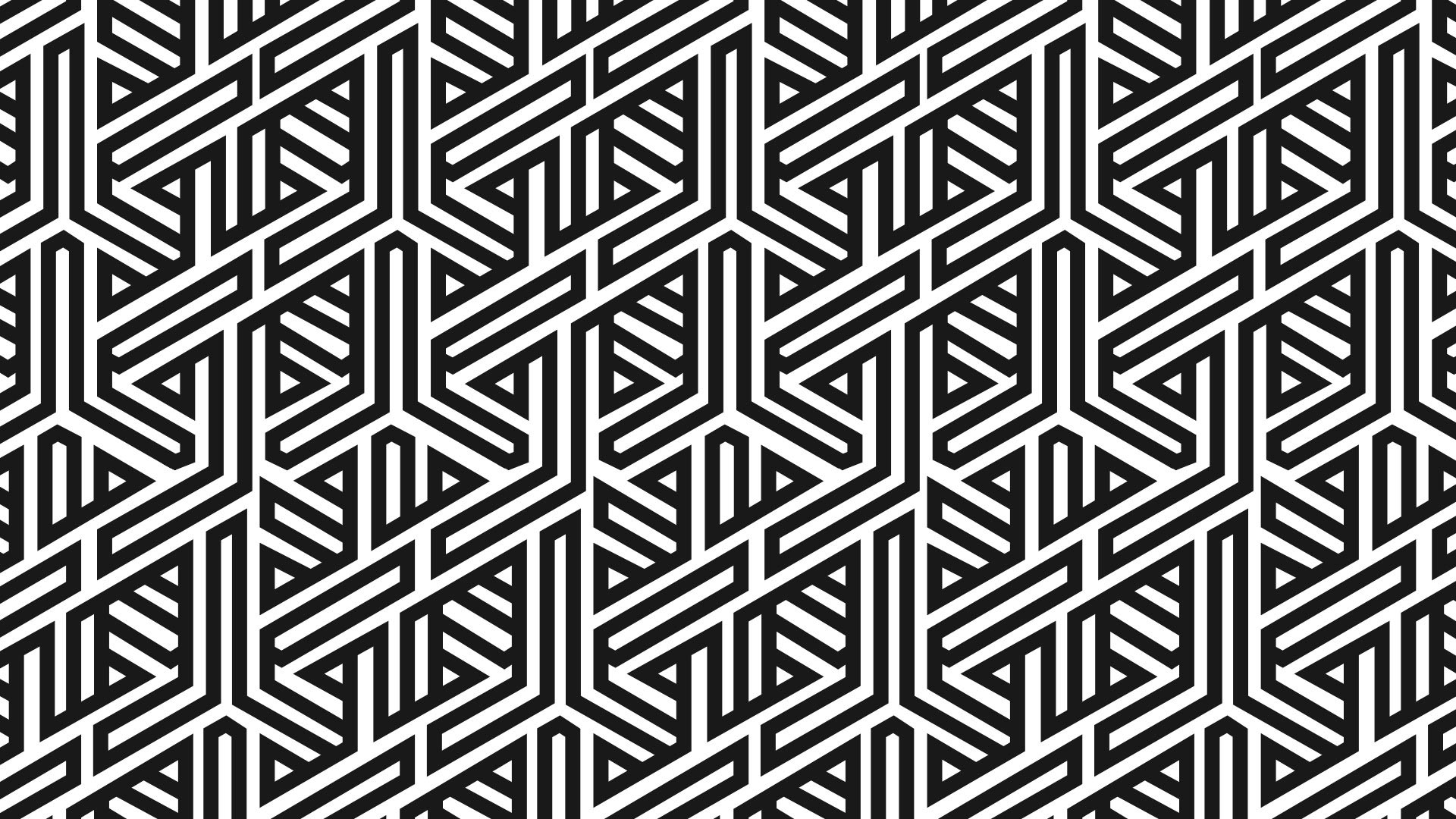
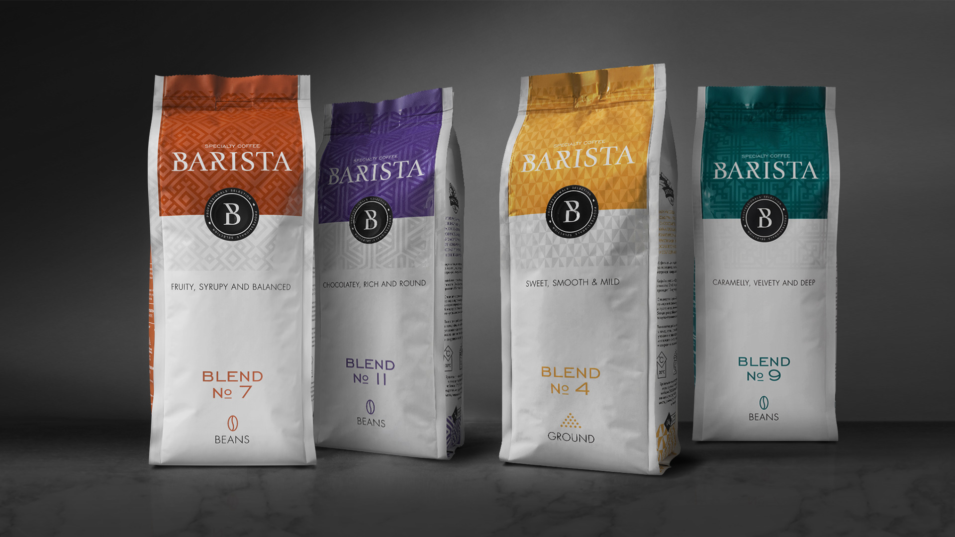
THUS, THE PACKAGING FOR EACH NUMBERED BLEND HAS ITS OWN COLOUR CODE, INDICATING THE RESPECTIVE STRENGTH, WHILE PICTOGRAMS ON THE BACK DESCRIBE THE FLAVOUR. ADDITIONALLY, DIFFERENT GEOMETRIC PATTERNS WERE CREATED FOR THE VARIOUS PACKAGES, WHICH ALSO CREATE
A VISUAL LINK TO THE CORPORATE DESIGN OF THE COMPANY’S OTHER COFFEE BRANDS. MOREOVER, THE SUBTLE VARNISH FINISH ON THE PACKAGING UNDERLINESTHE COFFEE’S HIGH QUALITY.
DELIVERABLES
CORPORATE IDENTITY
PACKAGING
WEBSITE / WEBSHOP
SERVICES
BRAND ASSETS
ART DIRECTION
WEB DESIGN
CREATIVE DEVELOPMENT
OBJECTIVE
Create an identity that blends as a label of Soyuz Coffee with the corporate identity of Soyuz Coffee. The Barista label must present itself as the progressive, qualitative and international coffee that is distinctive in the coffee landscape in Russia.
SOLUTION
First of all, it was important to know which preconditions apply for Barista to then complete the project in phases. After the Barista identity, it was first applied to the packaging and later rolled out over various online and offline means.
IDENTITY
FRAMEWORK


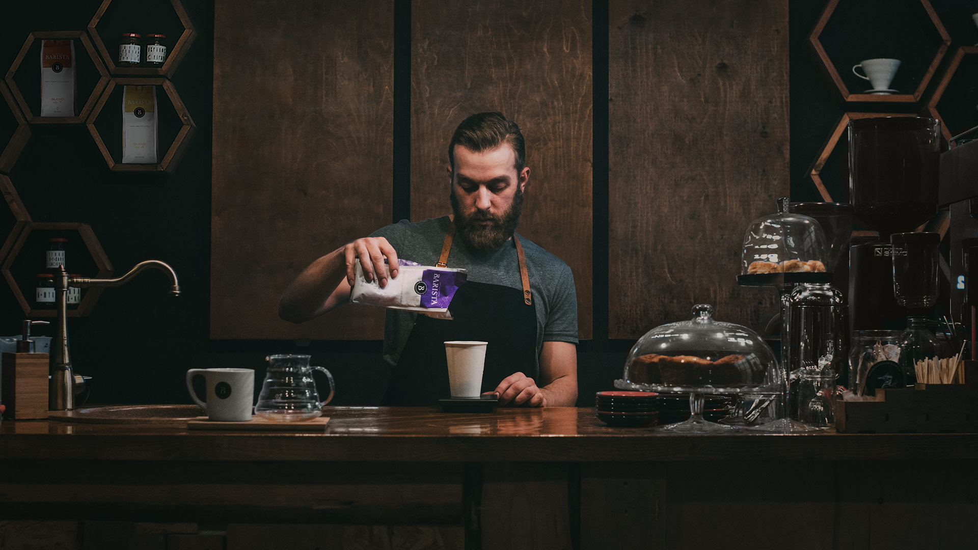
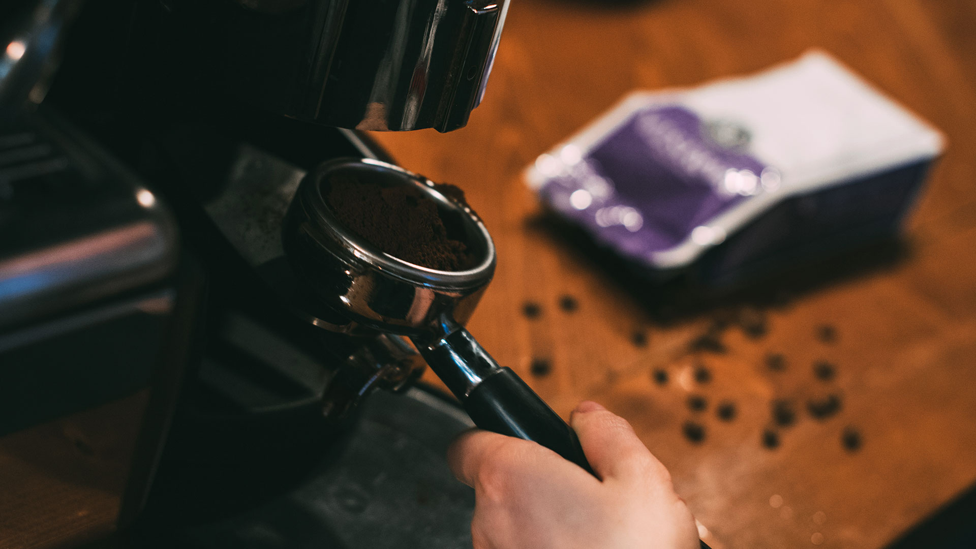
BRAND ASSET - PHOTOGRAPHY
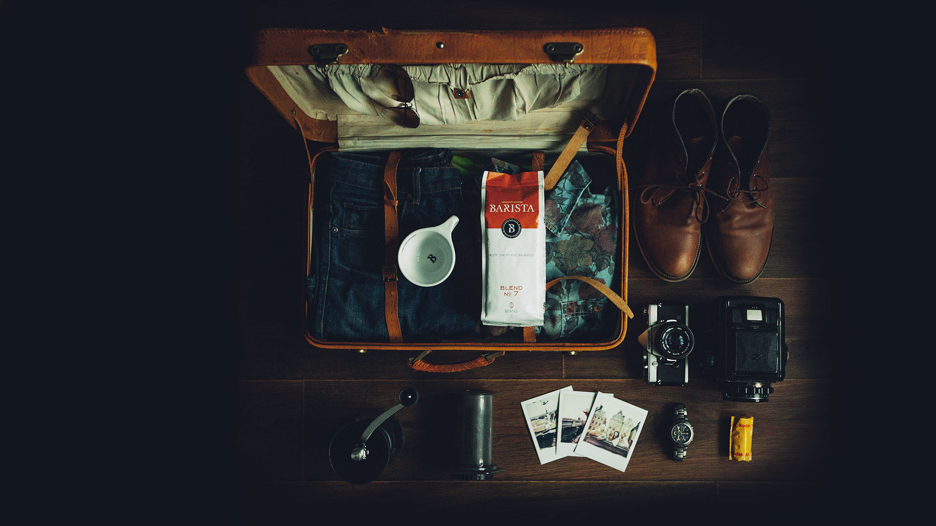
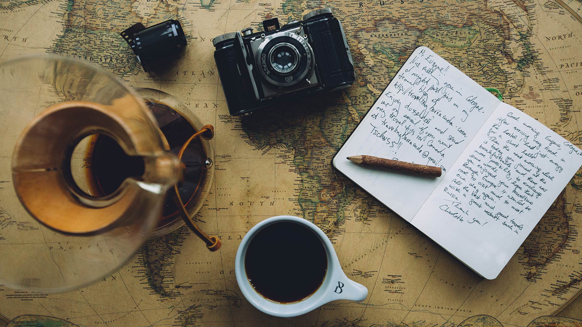
In addition to the corporate visual language, each Barista blend is provided with a brand story that is recorded in photography. Every taste (blend) gets a visual story that is provided with contemporary croppings and photographic filter applications that can be seen as typical Soyuz Coffee.
FRAMEWORK - BRAND ASSETS
LOGO
MONOGRAM - DEVICE
BRAND ELEMENT
COLOUR PALETTE
TYPOGRAPHY
PHOTOGRAPHY
May your
Coffee kick in

BEFORE
REALITY DOES
SOYUZ COFFEE BARISTA
TRIMM - Digital Craftsmanship
Moutlaan 25
7523 MC Enschede
THE NETHERLANDS
info@TRIMM.nl
+31 (0)53 4800480